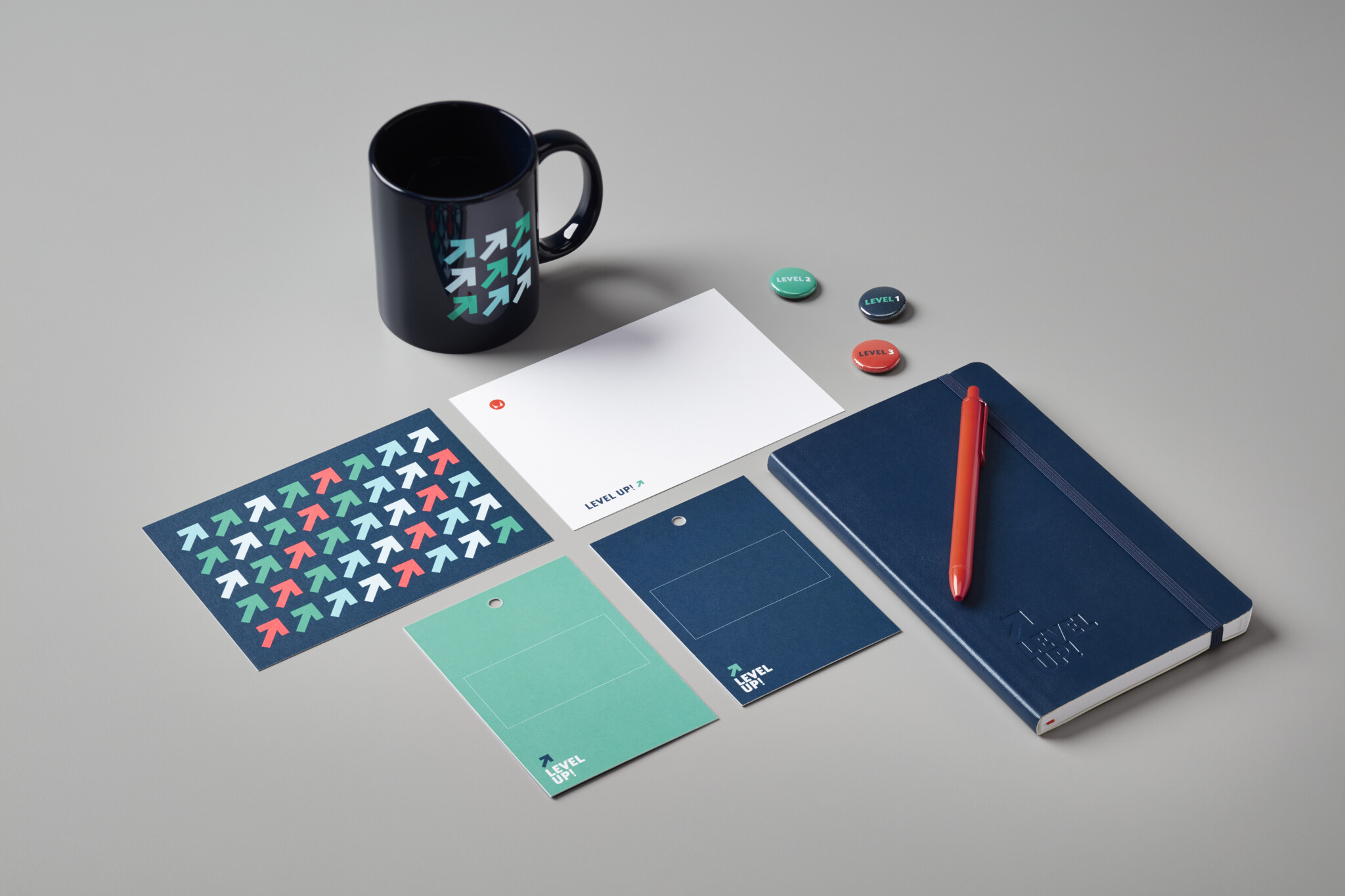
Event Swag
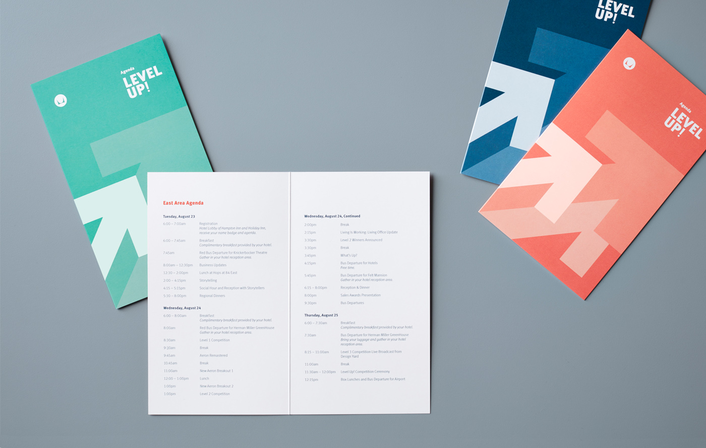
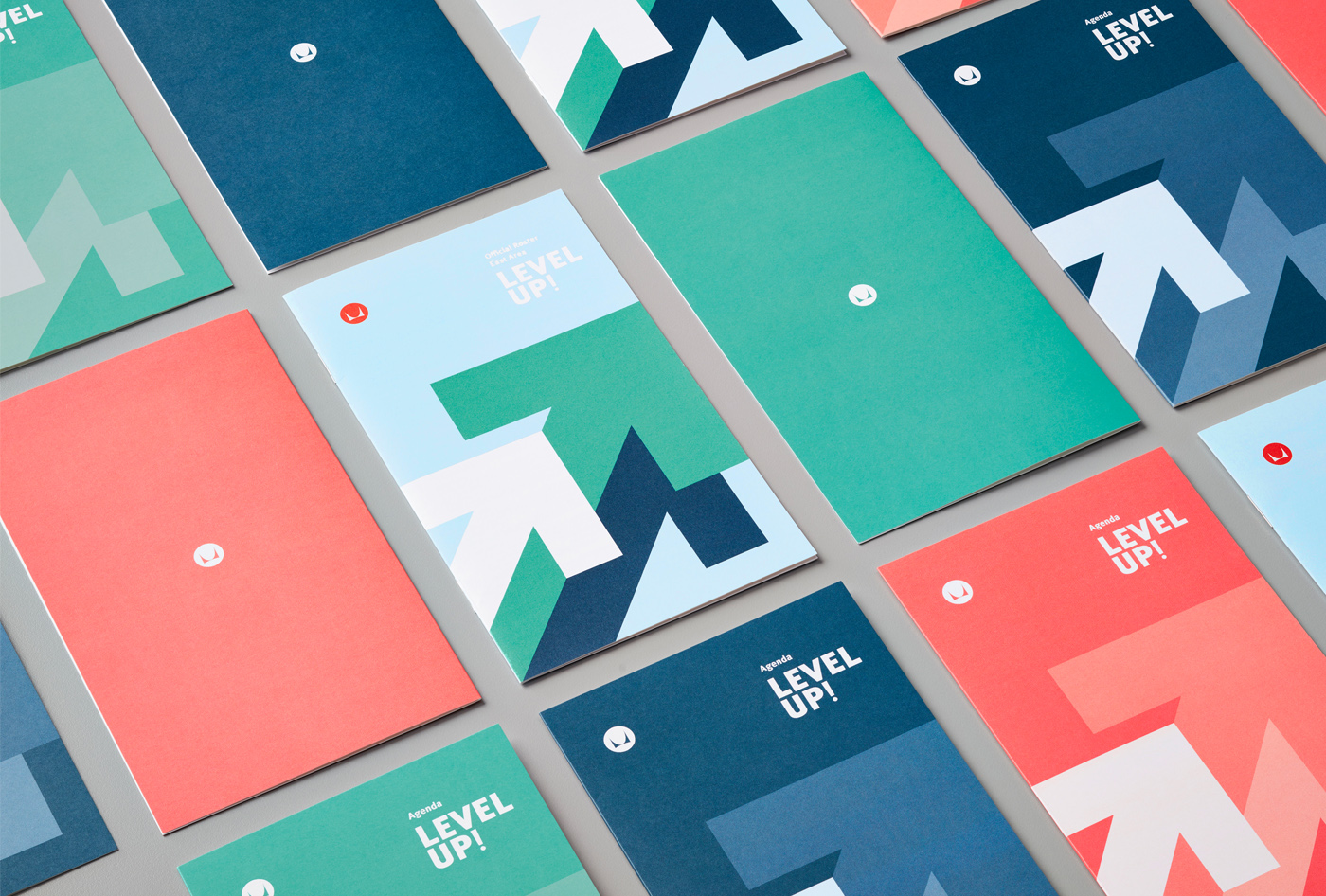
This one's for a board and card games convention. They had always gone with a gamer/geek theme - the last one was very neon green and over the top 80's inspired. I pitched them a design that could enhance the brand's optics, to the point of them rethinking the venue and charging higher ticket prices.
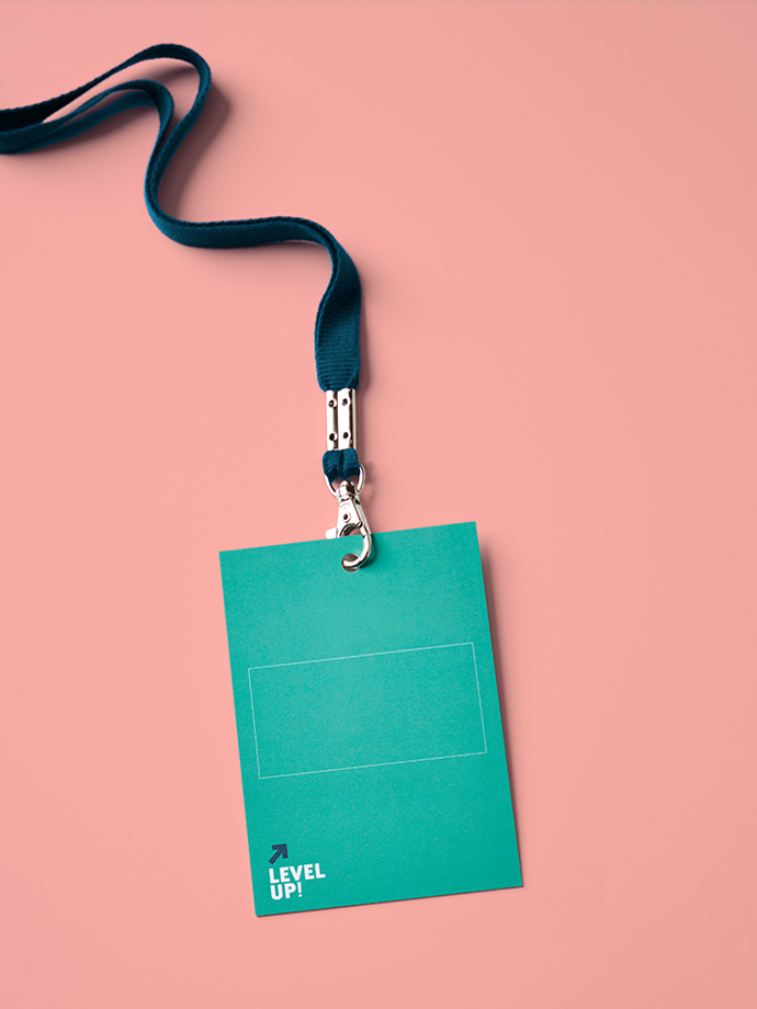
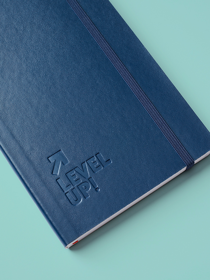
The client immediately greenlit the operation, save for one ask: that the new identity be literal and to the point, incorporating an arrow icon pointing up. The new logo was nailed down in two rounds.
Results
There was no denying the caliber of brand makeover, which mades waves in social media conversations. We made sure to capture and share organic posts that documented the new swag in a positive light. The client was extremely satisfied overall.