Brand Upgrade
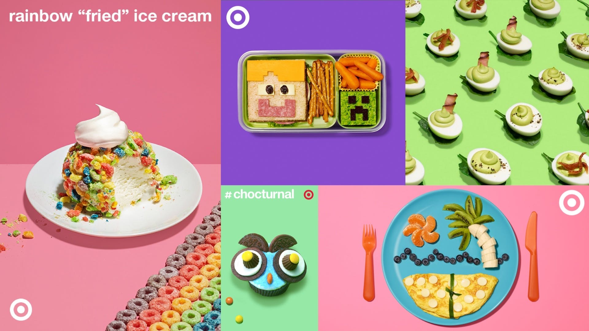
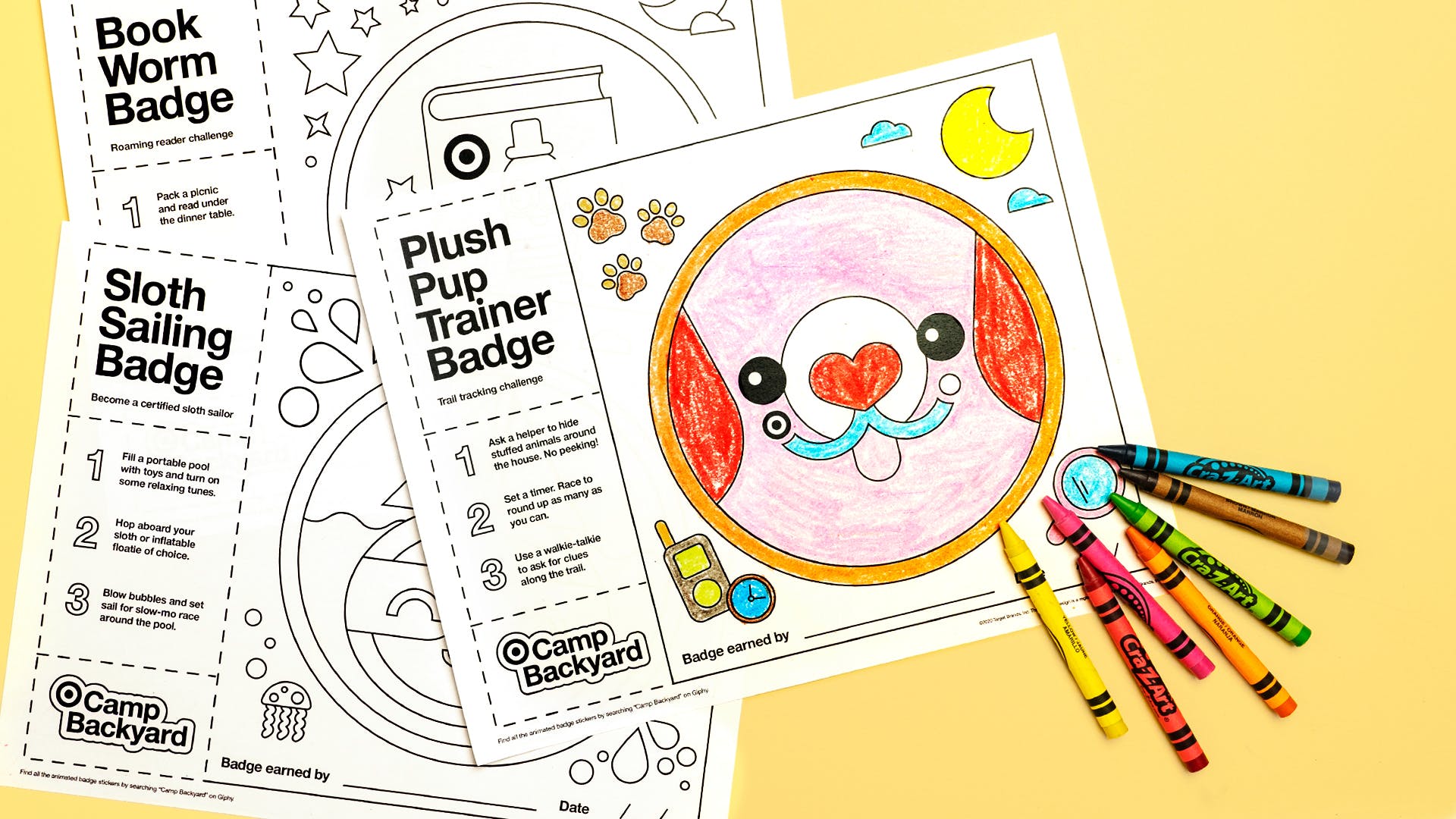
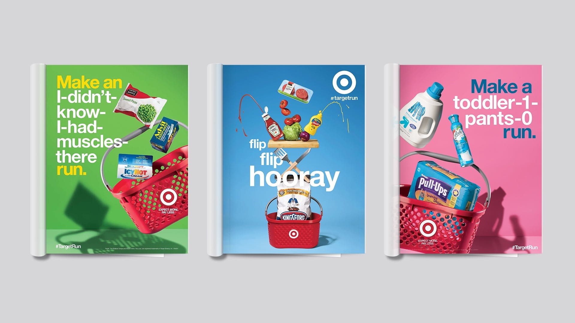
Headed a team to refresh existing visual language. The previous work went a little too red-and-white with recent design executions. Having established a solid working relationship with Tarjay's internal marketing, I was able to persuade them into adding and utilizing a wider spectrum color palette. Typography was not neglected: added new weights and defined font size pairs to break up the messaging.
Results
After some rounds of reviews and feedback, the comps I art directed were used in store signage - and the successful Camp-based social media initiatives.